Hilton Moments Magazine
American Airlines Custom Publishing
Fort Worth, TX
Involvement
Art Direction/Photography
Credits
- James Ricks, Publisher
- Amy Robinson, Editorial Director
- J.R. Arebalo, Design Director
- Steven Lyons, Art Director, Photography
- Brian Keagy, Editor
- Karianne Harmon, Account Executive
- Chris Korbey, Photography
- Jill Broussard, Photography
Just two issues into its complete redesign, Hilton Caribbean’s Moments Magazine, was still a work in progress. Getting to fully own its third issue, I focused on refining the typography throughout. Redefining the typographic styles on features, adjusting the type set to be more cohesive throughout, and introducing a more casual and relaxed feel as requested by the client.
Primarily developed as a property directory and ad vehicle for Hilton Caribbean, Moments provides its guests high-quality features and content regarding points of interest near its properties, activities, and fashion. The book needed to maintain a consistent association to the brand and bring the reader in to the island life.
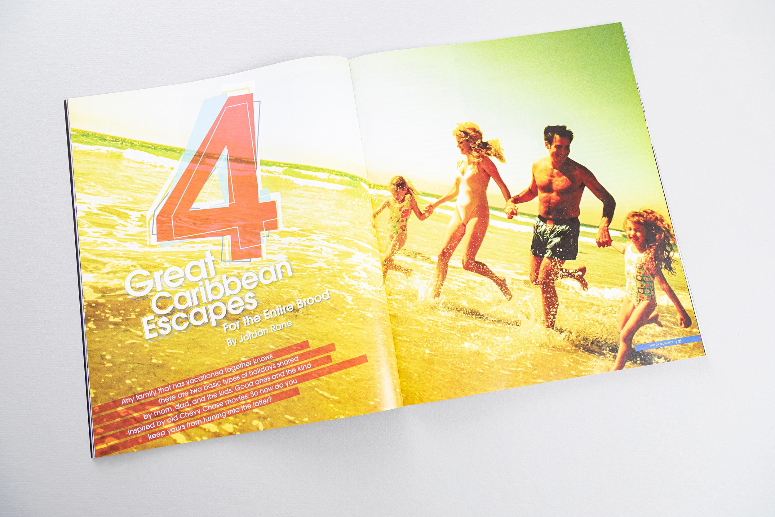
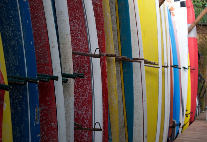
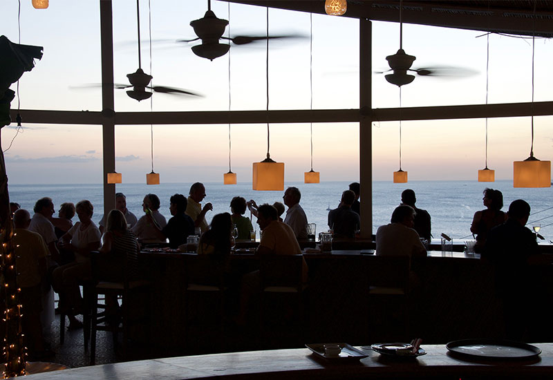
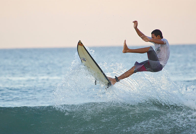
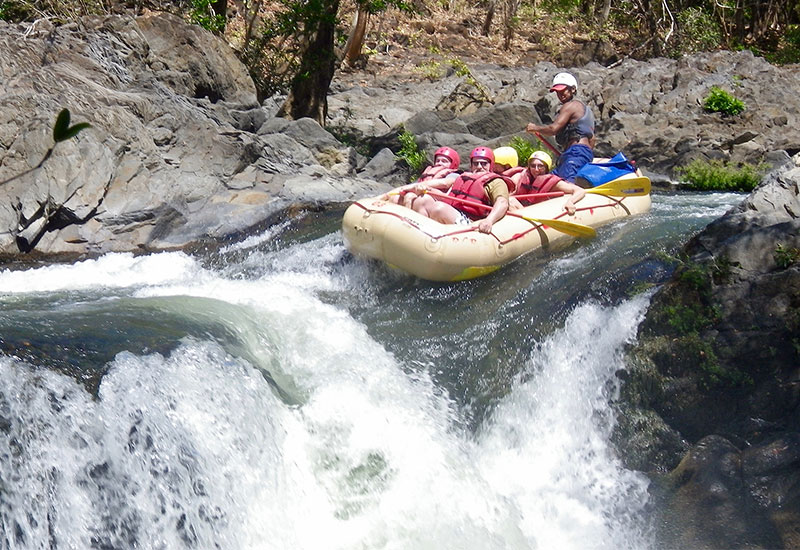
Typography was just one aspect, shooting more graphical and visual custom photography was another. I focused on action and movement to help illustrate the editorial. In the following issue, I also traveled to Costa Rica, shooting on location for the primary feature.
My role for this project was as art director, designer, and photographer working under Design Director J.R. Arebalo. I created and executed layout concepts, directed photoshoots and shot photography. Special credit to outgoing design director, Troy Myatt, and senior designer Darren Smitherman for work on the initial issues of the redesign.
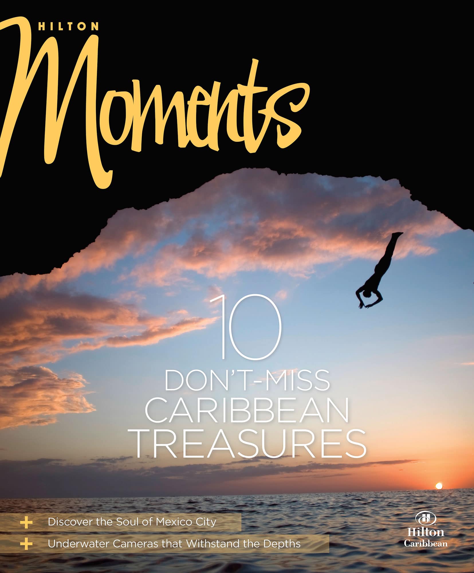
Each new cover for Moments focused on a primary scene, evocative of the primary feature. Direction for those shots centered on a focused subject and upper left negative space for the masthead.
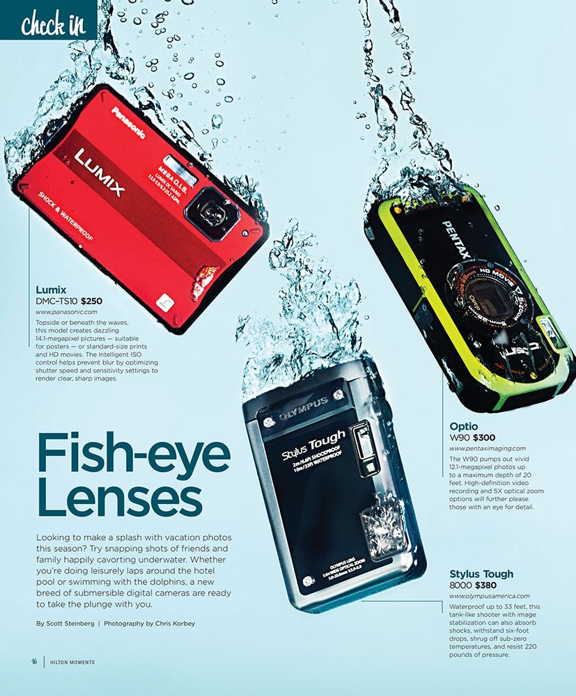
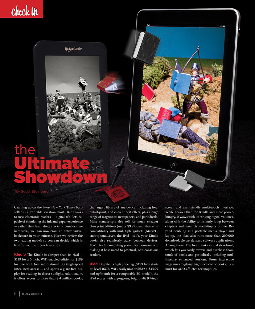
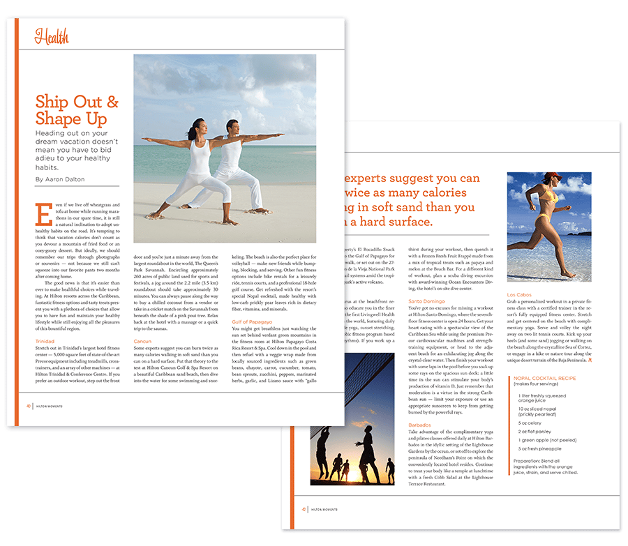
The FOB (front of book) section contained some of the biggest changes from previous issues. Refining the section identity with the playful script more related to the masthead and color blocks to stand out. More graphical custom photography allowed us to retain a tighter edit with the photo telling some of the story.
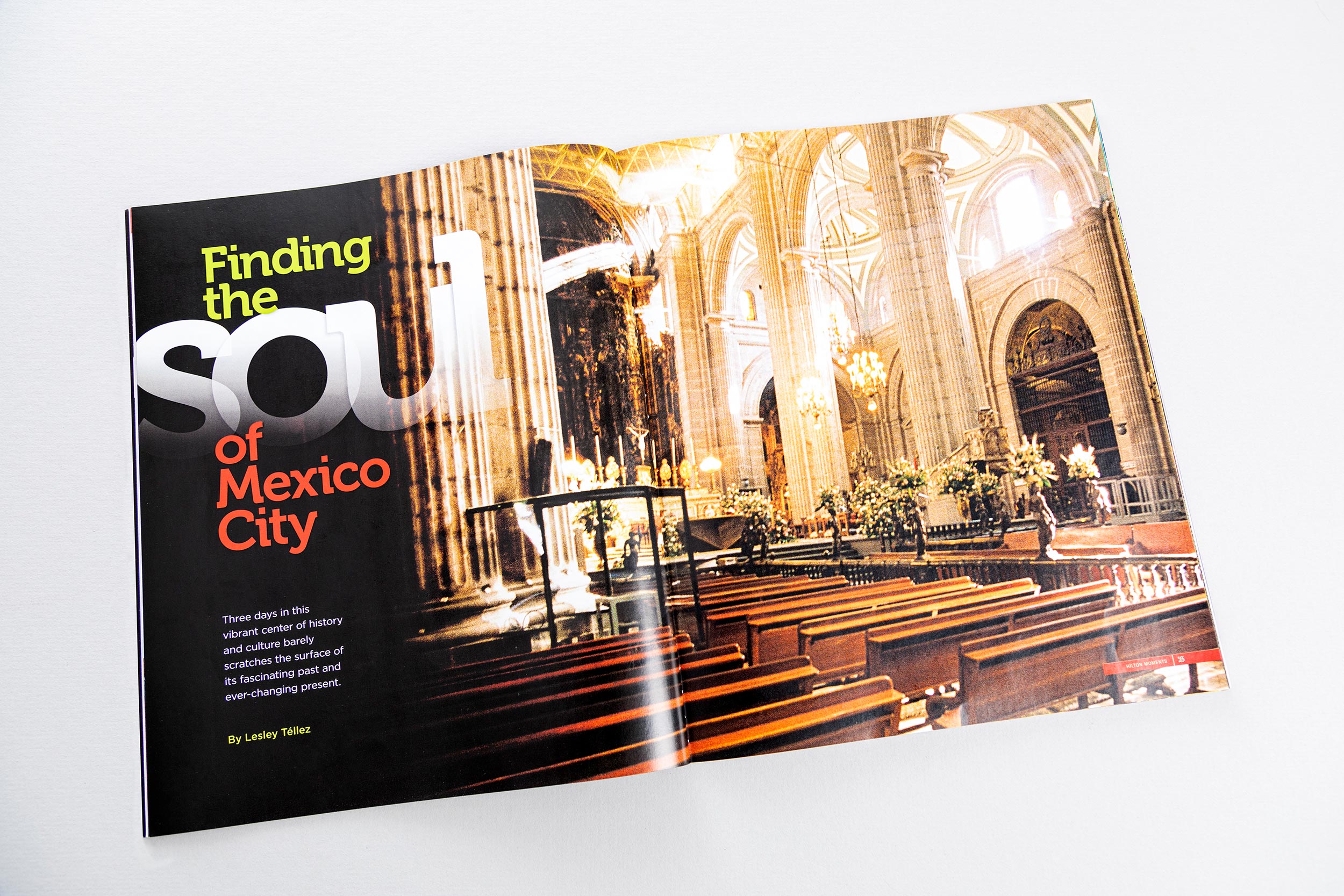
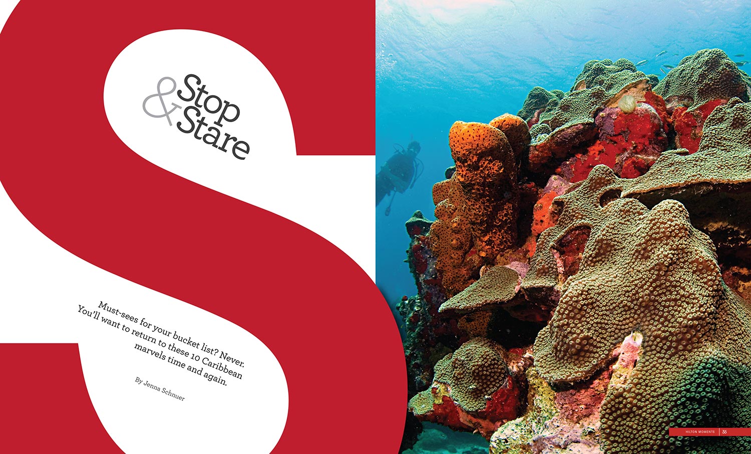
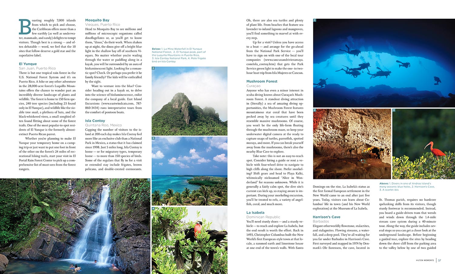
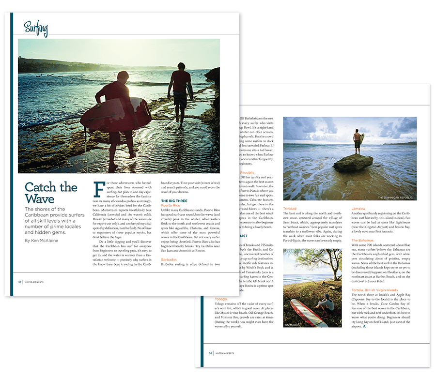
On the feature lead-ins, I took a more typographical approach on the opening spread leading in to the photography. Again, bringing a playful, relaxed tone with a unique design for each story. A clean editorial layout grid allowed for the editorial to breath around the accompanying photos.
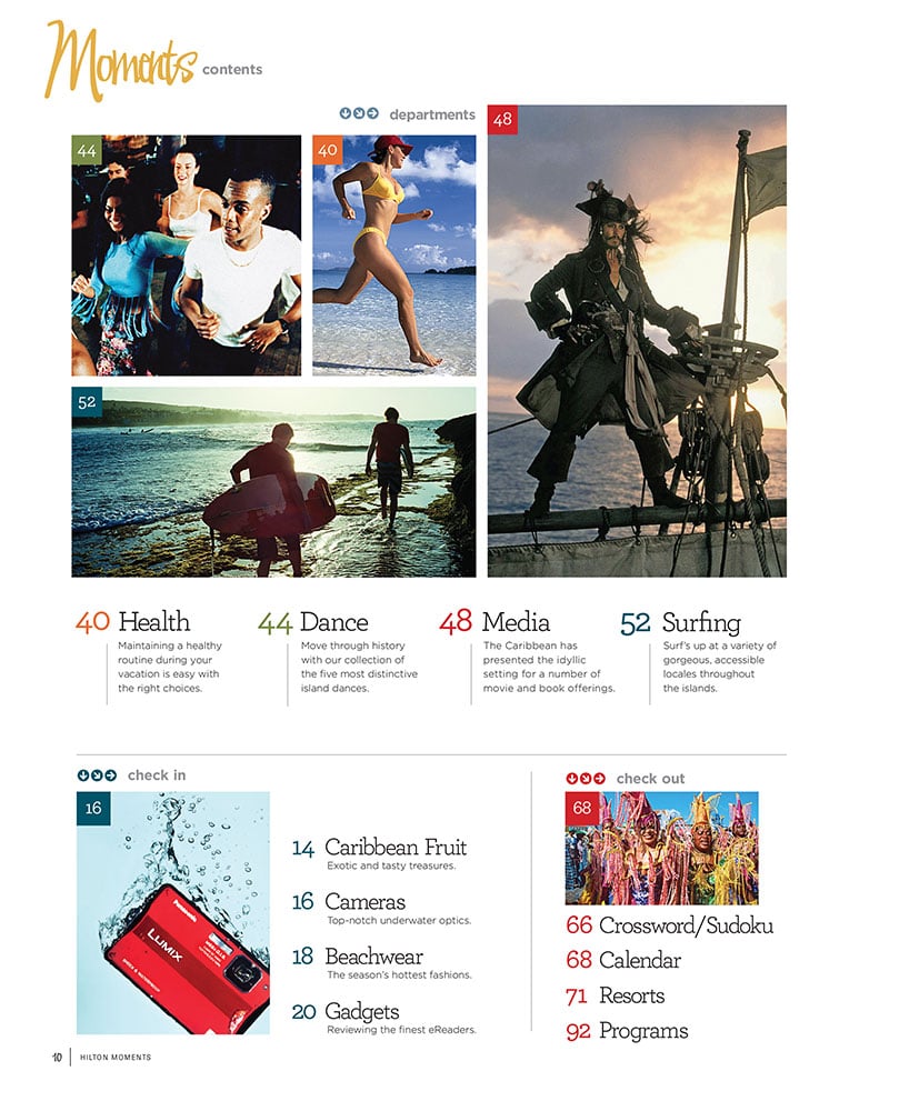
The department pages retained some of their previous layout, while I refined the grid and brought type styles from the other sections for consistency. I updated the overall color palette to bring brighter shades to help sections stand out.
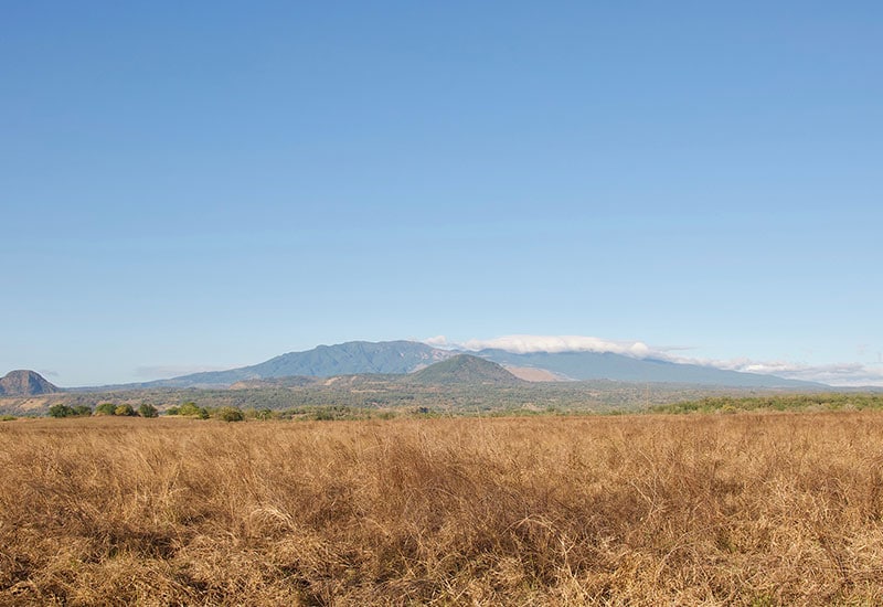
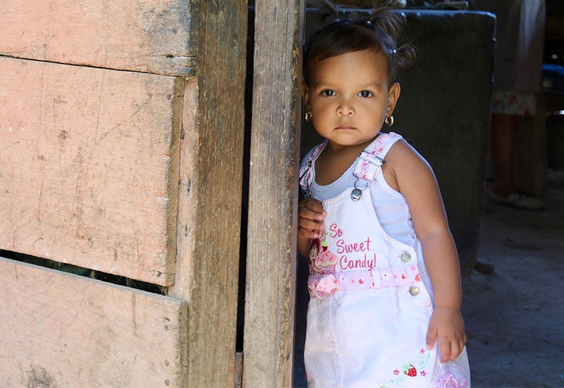
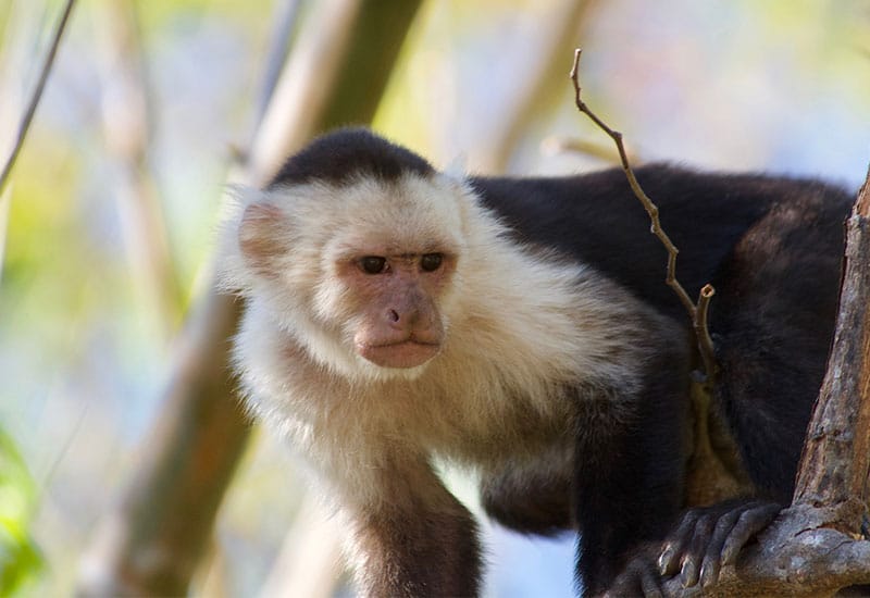
A truly remarkable adventure, traveling to Costa Rica to shoot photography for the next issue’s cover and main feature, yielded a host of interesting shots. I organized an itinerary shot list, working with the editor/writer and our guides, running a location photoshoot as photographer.


